Following in the visual traditions of works such as Bladerunner or the comic book version of The Surrogates, The Tomorrows is a dystopian cyberpunk story. Set some time after the 21st Century, we follow Zoey, an artist (which is apparently illegal in this future) as she she gets wrapped up in an underground resistance known as The Tomorrows. Who are The Tomorrows? What are they rebelling against? What has happened to bring about this future? It’s all a bit vague, but we do know at least that they’re butting heads with the Atlas Corporation and supposedly there’s a doomsday device that can instantly control anybody on the planet.
The thing that struck me right off the bat with this book was the visuals. Jason Copland’s artwork, especially paired with Adam Metcalfe’s coloring is right up my alley. The line work is loose and expressive, but never over the top or confusing. The action has a real sense of movement to it and the individual panel compositions are totally on point. The colors are bright and saturated, including neon pinks and blues. The whole book looks like a poster for the film Drive come to life. The costume and location designs are really nice as well. The cities are busy and bustling, filled with neon signs in in the air and dirt and grime on the ground. It feels like a mixture of Bladerunner and Akira. Everything is an exaggerated 80’s aesthetic and it totally works for the kind of story they’re telling.
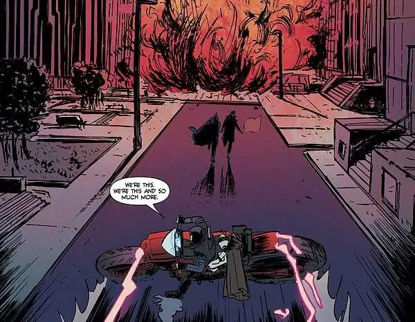

The writing on the other hand is a bit uneven. I love the visuals of the world, but they take almost no time to explain anything that’s going on, so the conflict feels very slapped together. We have a corporation and a resistance and they’re warring because I guess that’s what they’re supposed to do. Things move at breakneck speed and by the time our heroes are in danger we haven’t even had a single moment to get to know any of them. Without really understanding the conflict or connecting with the characters at all it begs the question of why we should care. Writer Curt Pires seems more interested in creating an overall tone and an edgy attitude than anything we can latch onto, though. There are tons of pop culture references, including everything from Toshiro Mifune to Andy Warhol to 120 Days of Sodom and characters utter lines such as, “I’m gonna murder the shit out of you.”
As a first issue it sort of does its’ job. I want to like it because I love the aesthetic. The colors and designs are really appealing in a retro-future kind of way and the artwork is well done. I’m interested in the world and characters they’ve presented, but they need to slow down so I can actually learn a bit about them. Action is good, and I’ve certainly criticized plenty of works for not having enough, but this feels like a bit much all at once. Hopefully they take their time with expanding on the world and giving the characters more personality in the upcoming issues, rather than simply giving everyone an overall edgy attitude.
Wicked Rating: 6/10